Choose your own journey
A personalization exploration for the QuickBooks website that became the default experience in Canada and the US, with variations tested and deployed across the UK and Australia.
A personalization exploration for the QuickBooks website that became the default experience in Canada and the US, with variations tested and deployed across the UK and Australia.
The short version: QuickBooks is inherently complex software, and the website reflected that complexity. Visitors, most of whom were small business owners and not financial experts, were arriving at a site that tried to speak to everyone and, as a result, was not fully connecting with many of them. The question we set out to answer was: how do we give each visitor an experience tailored to them and their business?
What followed was an exploration that began as a week-long innovation sprint, went through dozens of iterations, navigated its share of challenges, and ultimately became the default experience on the QuickBooks homepage in Canada. It was later adopted and extended by the US, with variations tested in the UK and Australia. The experience drove a 9% improvement in new customer acquisition versus the control, with engaged visitors converting at 17 times the rate of unengaged ones.
My role: Creative lead for the project from inception through rollout, responsible for design direction, process, and helping the broader team find alignment at critical moments.
Driving new subscriptions to QuickBooks meant understanding what was stopping visitors from signing up. Over the years, the team had run numerous optimizations to improve the experience. But when we stepped back, looked at past experiments, and listened directly to visitors, a clearer picture emerged.
The site was trying to speak to a wide range of audiences simultaneously. Most of those visitors were small business owners whose passion was their business, not financial management. The inherent complexity of accounting software, combined with an experience that was not tailored to who they were or what they needed, was creating confusion and friction at exactly the moment we needed clarity.
The question became: what if we could present each visitor with an experience built around them?
The seed of this idea predates the project itself. Years earlier, I had explored the concept of a fully customizable site, one where the entire experience would adapt dynamically based on visitor behaviour. It was an ambitious idea, and not yet feasible. But it stayed in the back of my mind.
When Intuit’s Global Engineering Days (GED) came around, a recurring initiative that gives teams a dedicated week to step away from day-to-day work and explore new ideas, it felt like the right moment to revisit it in a more grounded form. We partnered with our developers and the GTM marketing team and used that week to work through initial designs and build early prototypes. That exploration became the foundation for everything that followed.
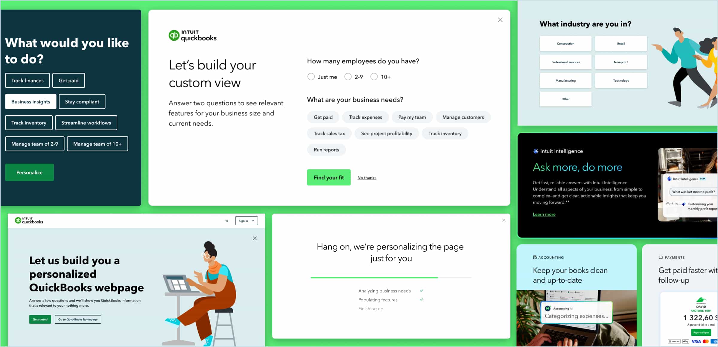
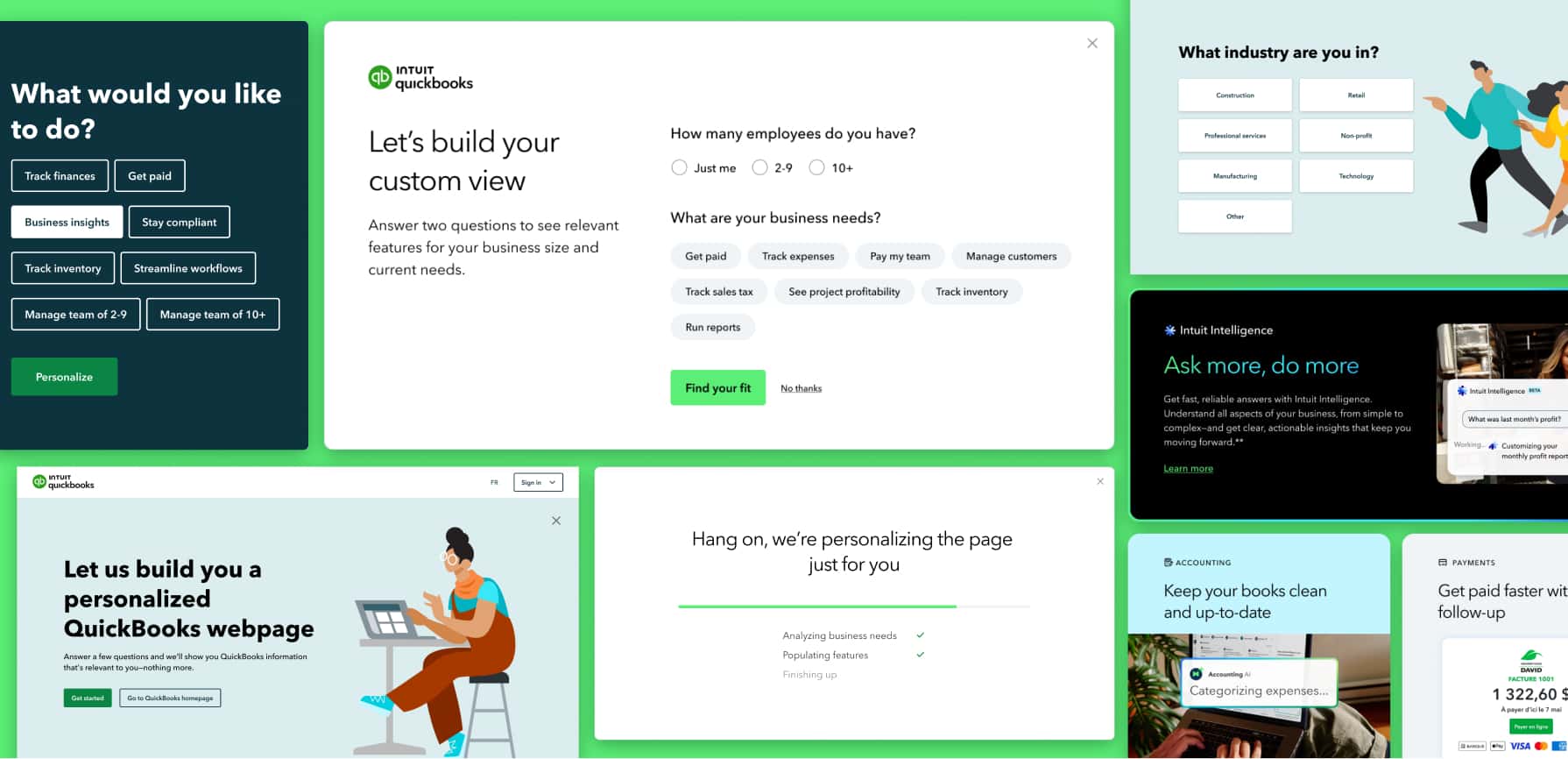
Starting simple and testing into complexity. Early explorations ranged widely, from a single qualifying question to fully dynamic experiences where the visitor’s actions shaped everything they saw. Some of these were technically feasible. Others were not, at least not yet. Rather than pursuing the most ambitious version from the start, we ran a prioritization exercise based on technical and time constraints, then took the most viable concepts through user testing to understand which had the most potential and where the biggest opportunities for improvement were.
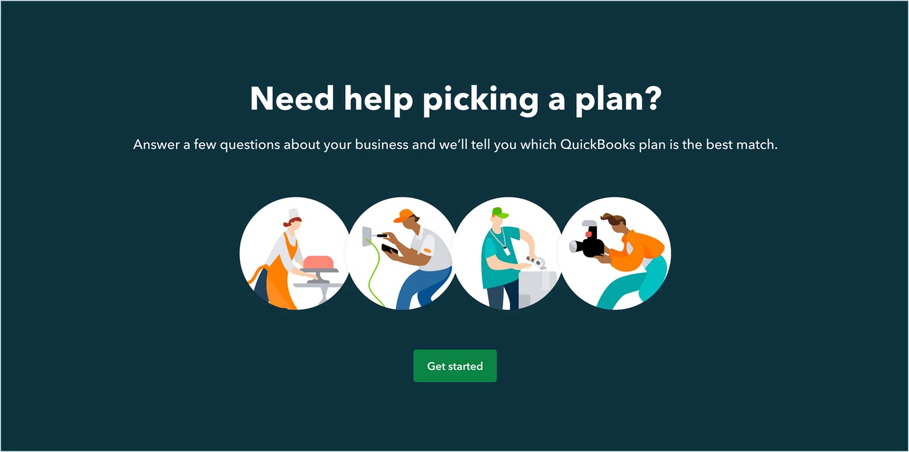
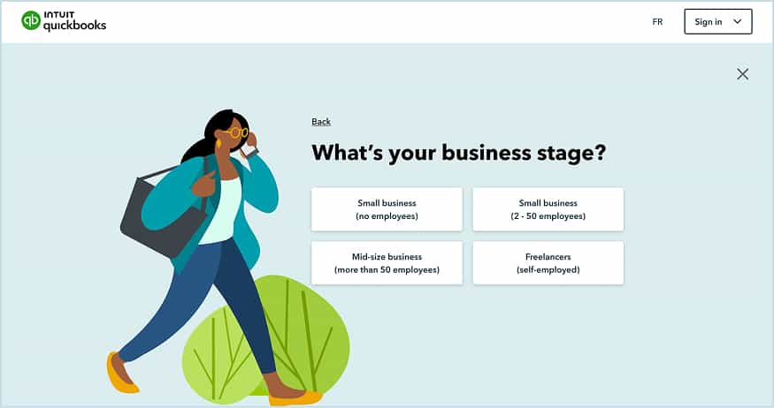
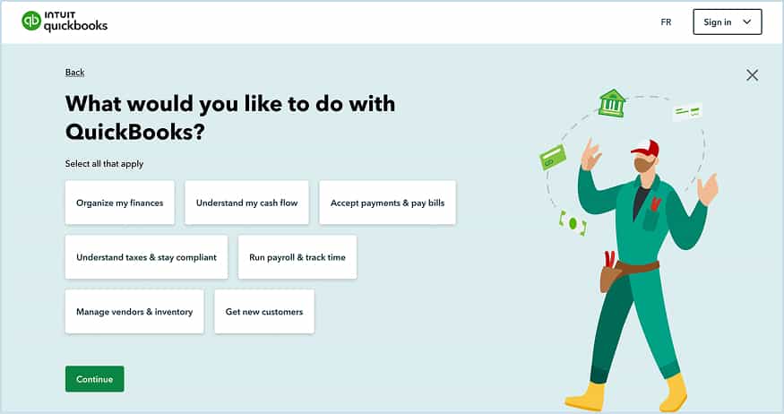
What we landed on for the first iteration was a short series of six questions that would allow us to recommend the right QuickBooks product based on what visitors told us about their business. It was a deliberate first step: simplify the most complex part of the site by making it a conversation rather than a decision.
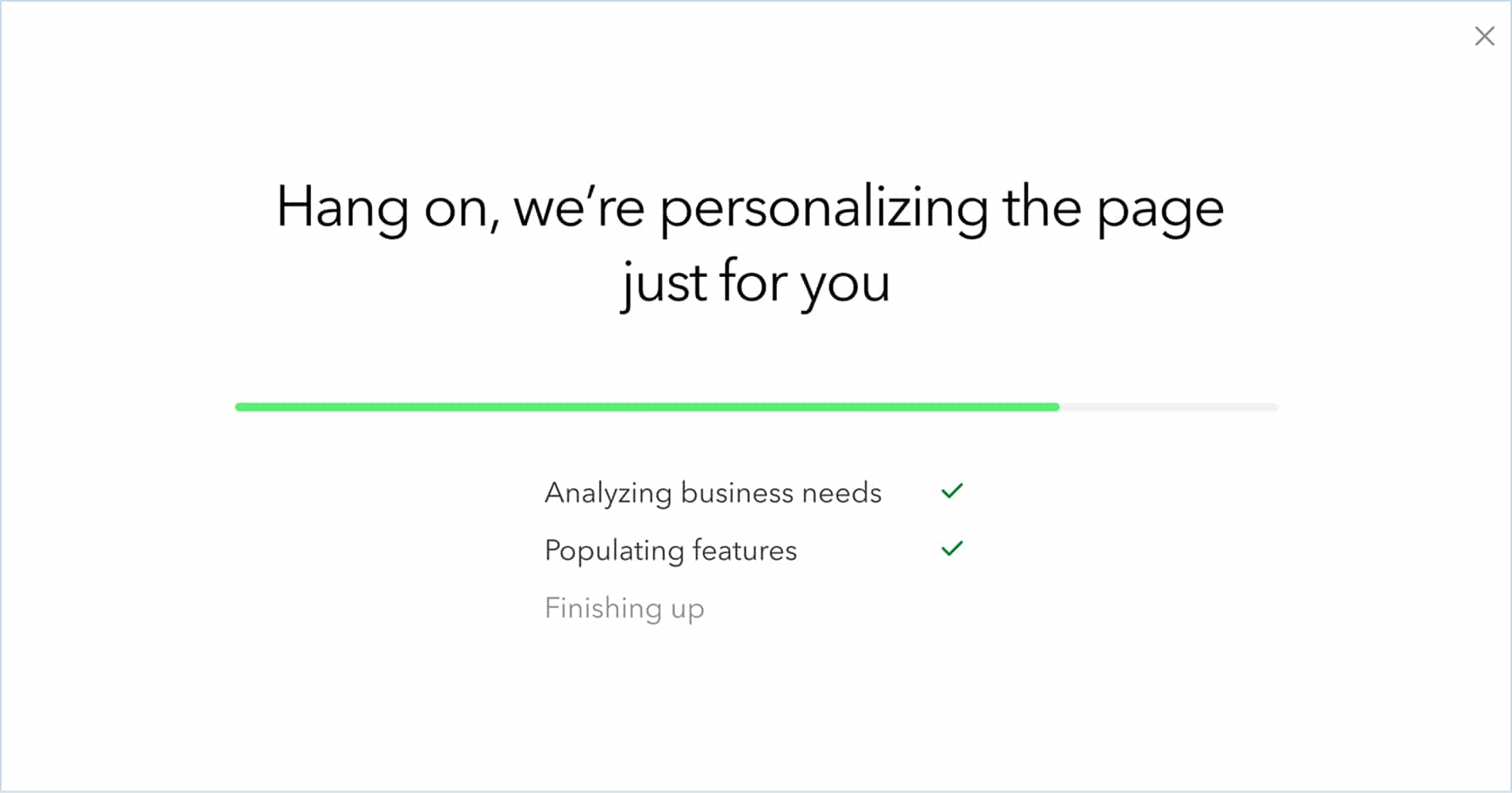
Iterating continuously. From that first version, the work never really stopped. Questions changed. The entry point moved. The results page evolved. This was an extension of a pattern the Canadian team had established: test into experiences rather than launch them fully formed, so that each change can be measured and its impact on the overall experience understood. Every experiment, win or loss, generated learning that fed the next iteration.
Navigating the challenges. The project had a stop-and-start quality that tested the team’s commitment to it. At times it was deprioritized in favour of other initiatives. At others, the creative was not gaining the traction needed in user testing, which required stepping back, regrouping, and trying new approaches. There were also moments where the design and marketing teams needed to realign on direction before the work could move forward. Each of these moments required bringing the team back to the original problem and finding a new path forward together.
Leading the creative and the process. Beyond leading the design direction, a meaningful part of my contribution was helping the team find alignment when it was struggling. Sometimes that meant facilitating a full team discussion. Sometimes it meant pushing the design team to challenge its own assumptions. The project involved designers, developers, marketing, and research working together across its lifespan, and keeping that collaboration productive was as much a part of the work as the creative itself.
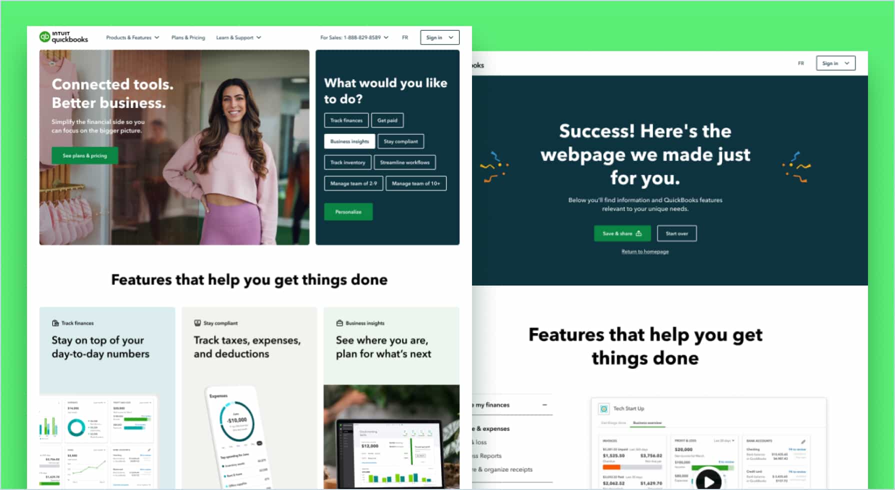
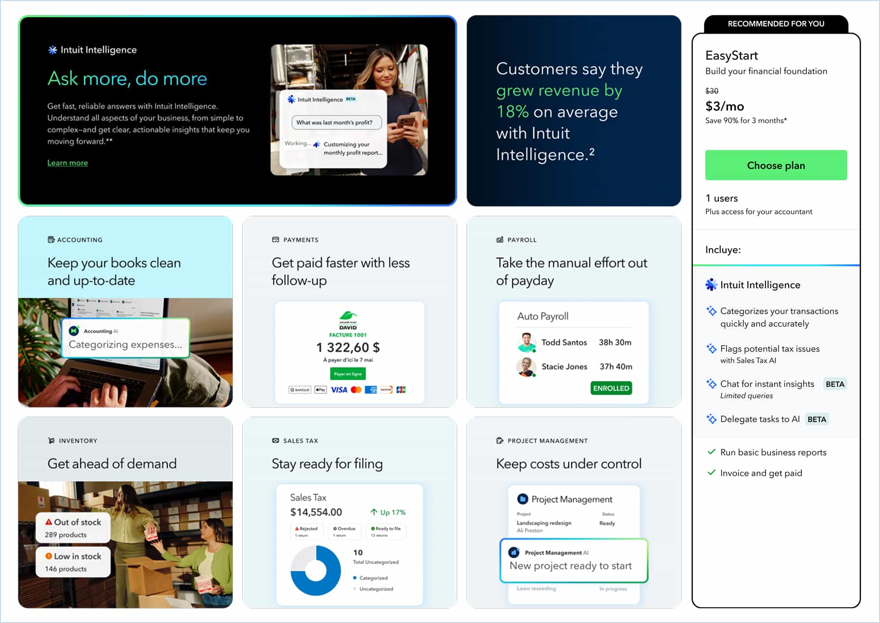
What began as a CTA in the hero section and a callout further down the page, feeding visitors into a separate experience, gradually evolved into something more integrated. Over time, visitor responses began driving live changes to the homepage itself. The experience and the page became one thing rather than two.
This version became the default experience in Canada. The US subsequently took the concept and implemented their own variation of it. When the UK and AU tested it, the structure remained consistent, but the questions and results were adapted to reflect local market needs and product differences.
The experience became the default on the QuickBooks homepage in Canada, was adopted and extended by the US, and was tested and deployed in variations across the UK and Australia.
The results validated both the approach and the underlying hypothesis. New customer acquisition improved 9% versus the control. Engaged visitors converted at 17 times the rate of unengaged ones, confirming that tailoring the experience to the visitor was meaningfully changing behaviour, not just adding noise.
The self-segmentation data told an equally compelling story. Solo entrepreneurs who answered the qualifying questions consistently signed up for the lower-tier product, with more than 50% converting in the same session. Mid-market visitors gravitated toward the higher-tier offering, added payroll, and converted at over 80% in a subsequent session. The experience was not just helping visitors find the right product. It was accurately identifying who they were and meeting them where they were going anyway.
This project is a good example of what it looks like to test your way into something. The most ambitious version of the idea, a fully customizable site that adapts entirely to visitor behaviour, was where this started conceptually, years before the project existed. The version that shipped was more modest, but it was real, it worked, and it opened the door to something larger.
The stop-and-start nature of the project was frustrating at times, but it also meant the team had to keep earning the right to continue. Every time the work stalled, we came back with something better. The final experience was stronger for having gone through that process.